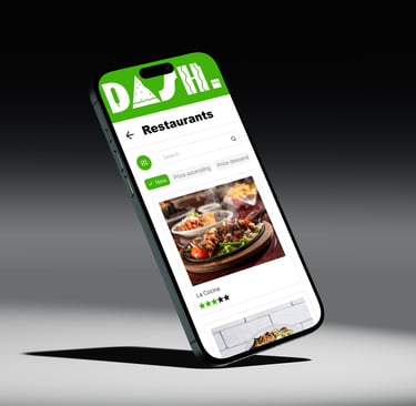
DASH
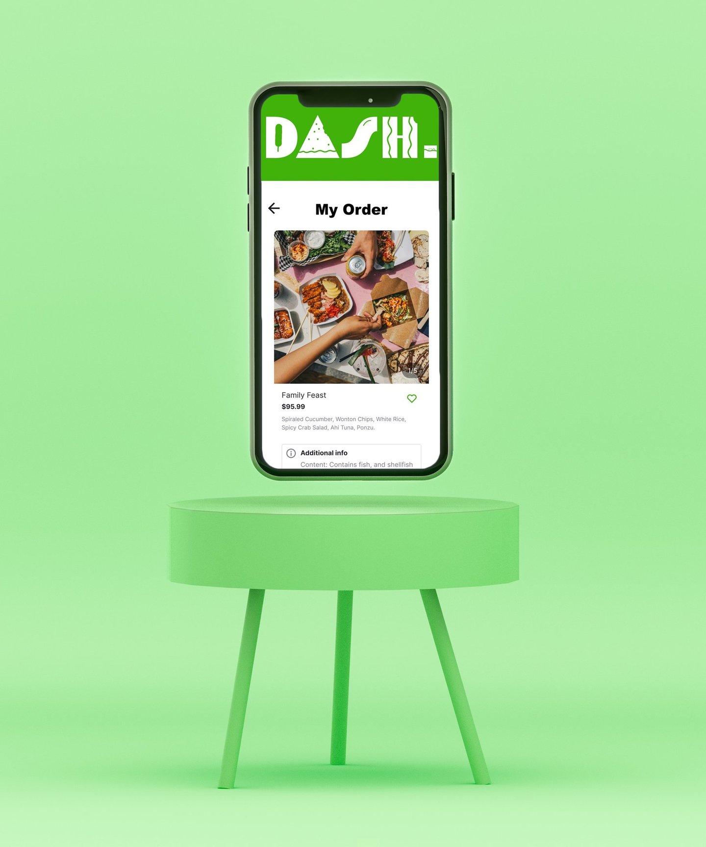
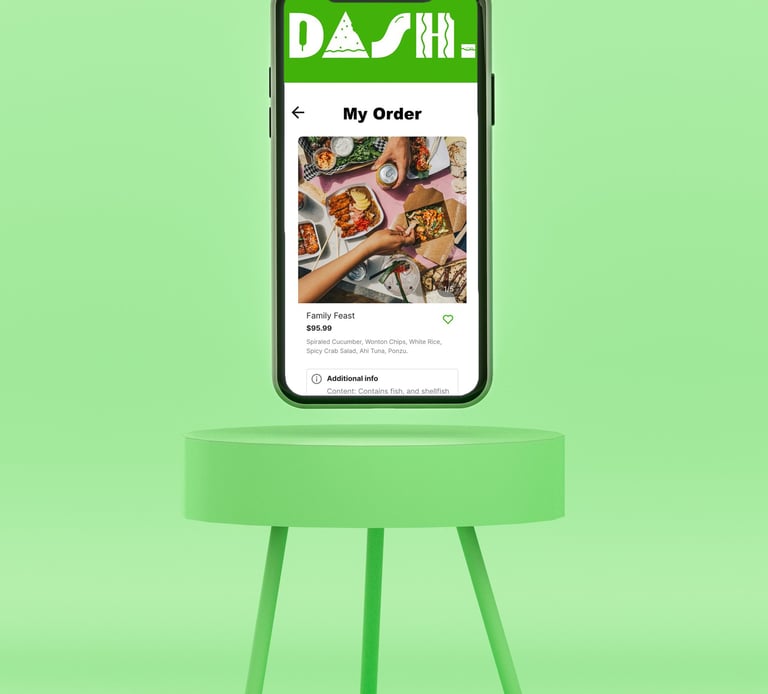
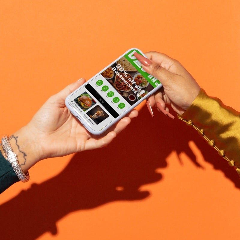
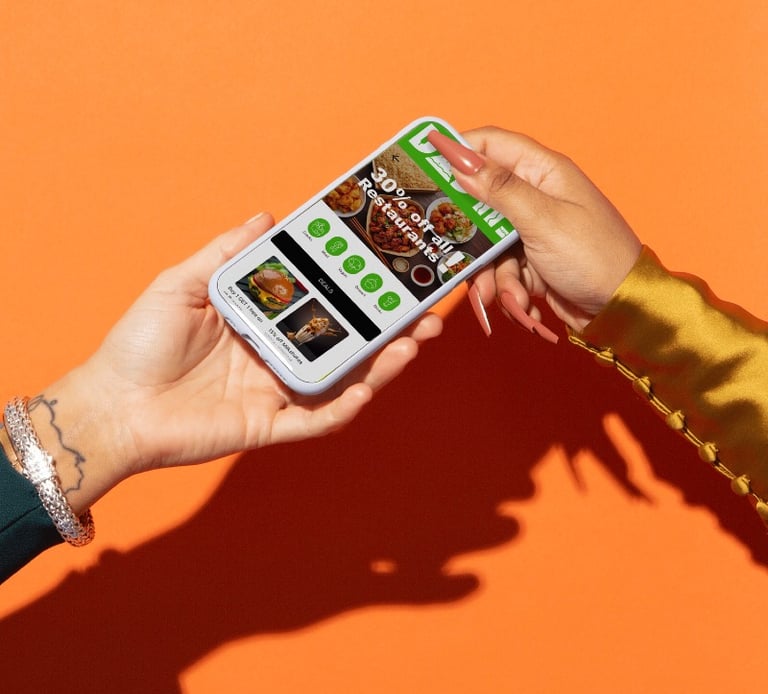
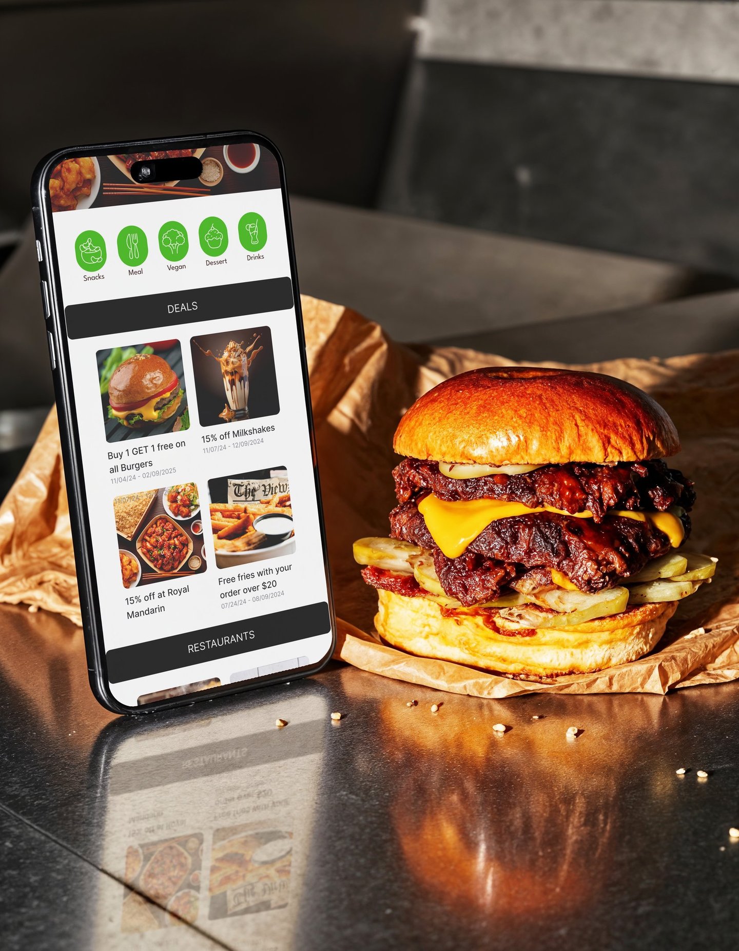
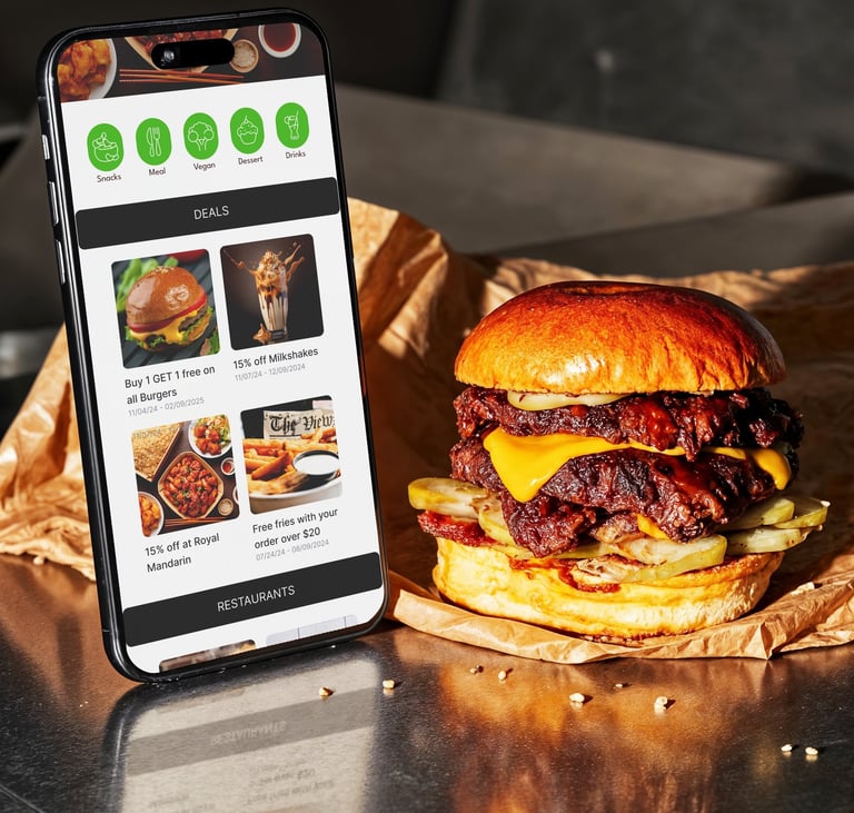
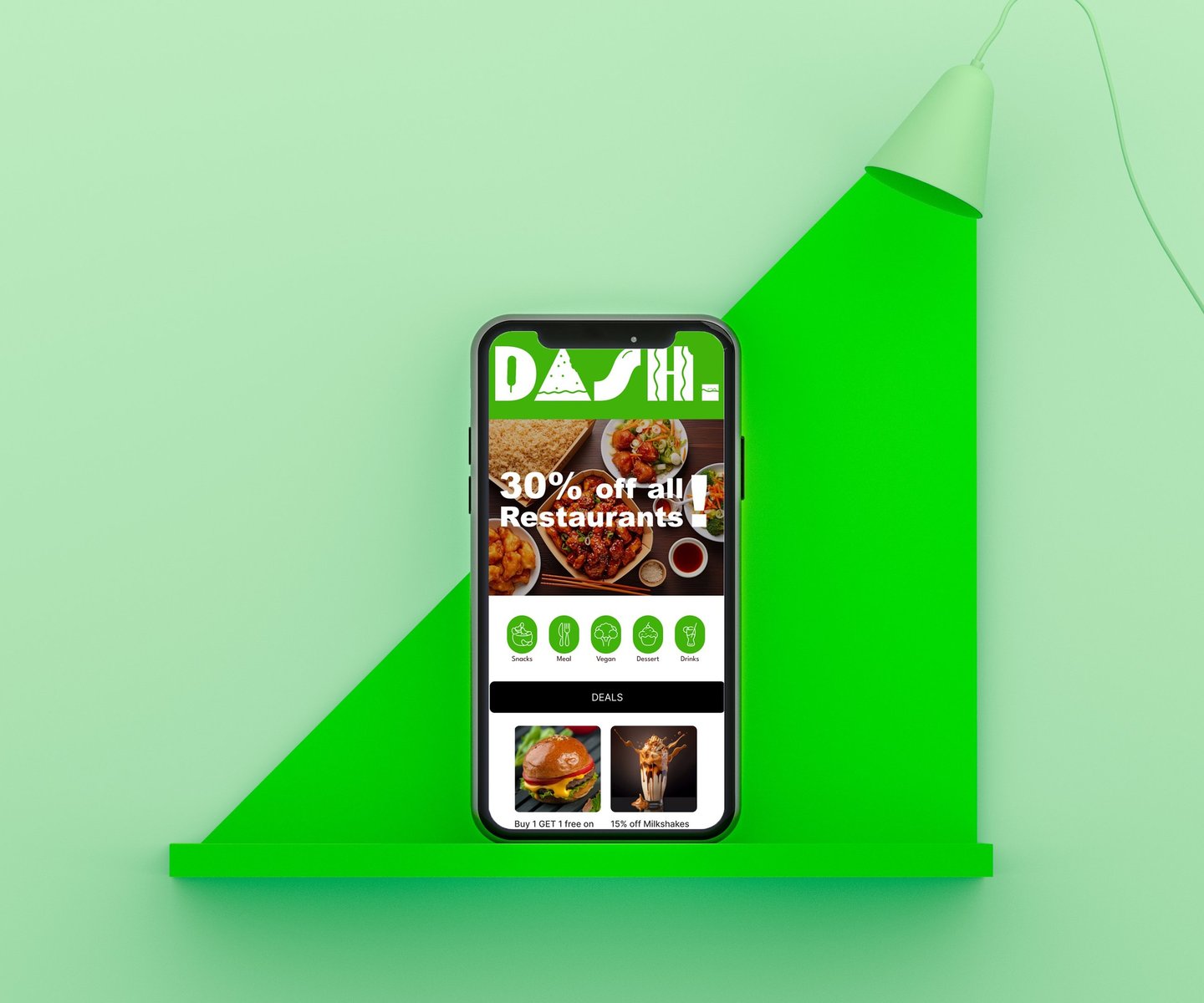
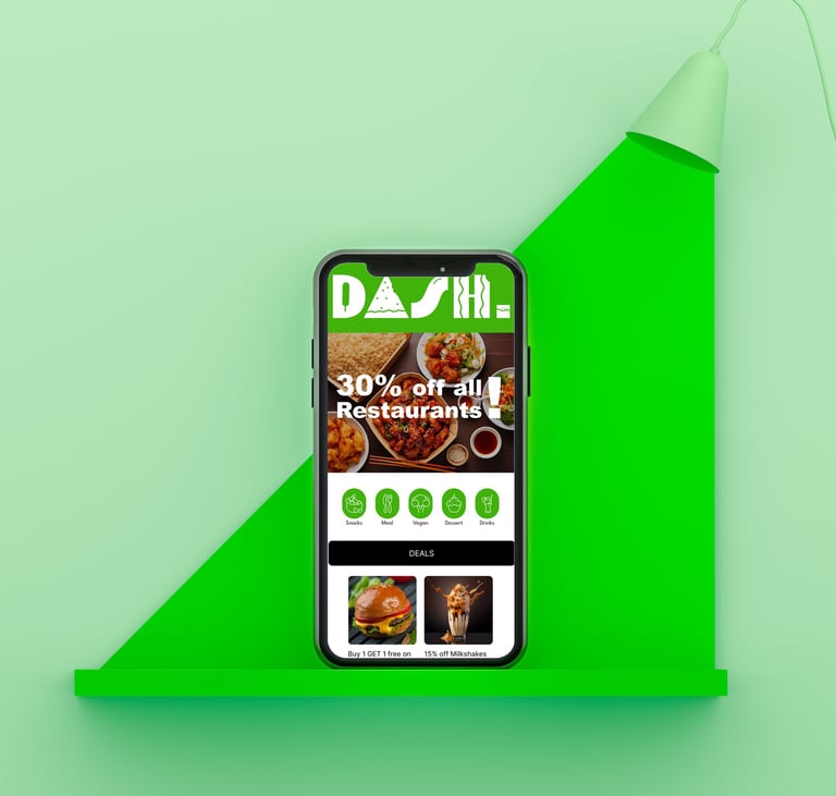
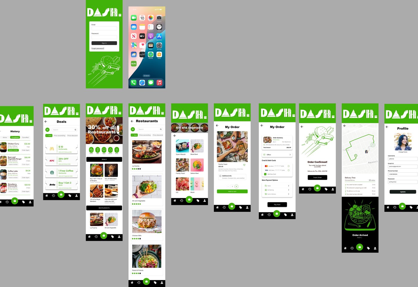
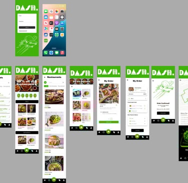
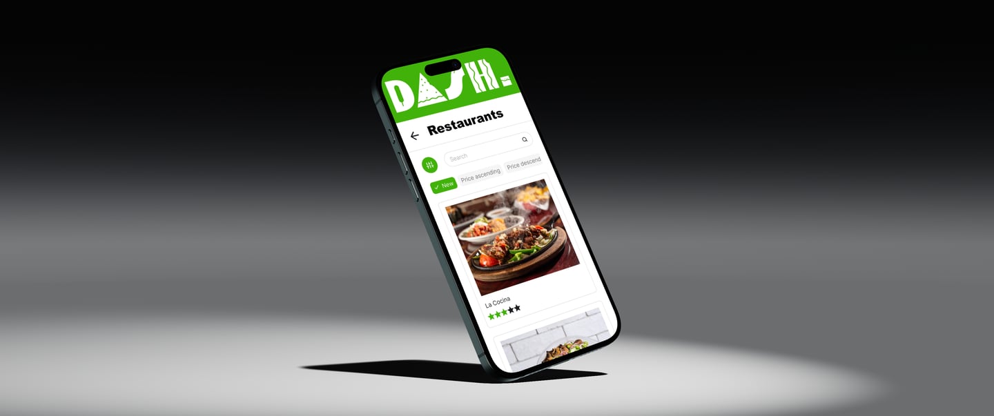
DASH is a modern food delivery app brought to life through intuitive UX/UI and cohesive branding. The identity centers on a logo built from familiar food elements, paired with a clean interface that balances freshness and functionality. A restrained palette of green, black, and white reinforces trust, quality, and ease; creating a digital experience that feels reliable, modern, and inviting.
Services: Branding, UX\UI
Client: DASH
Year: 2024
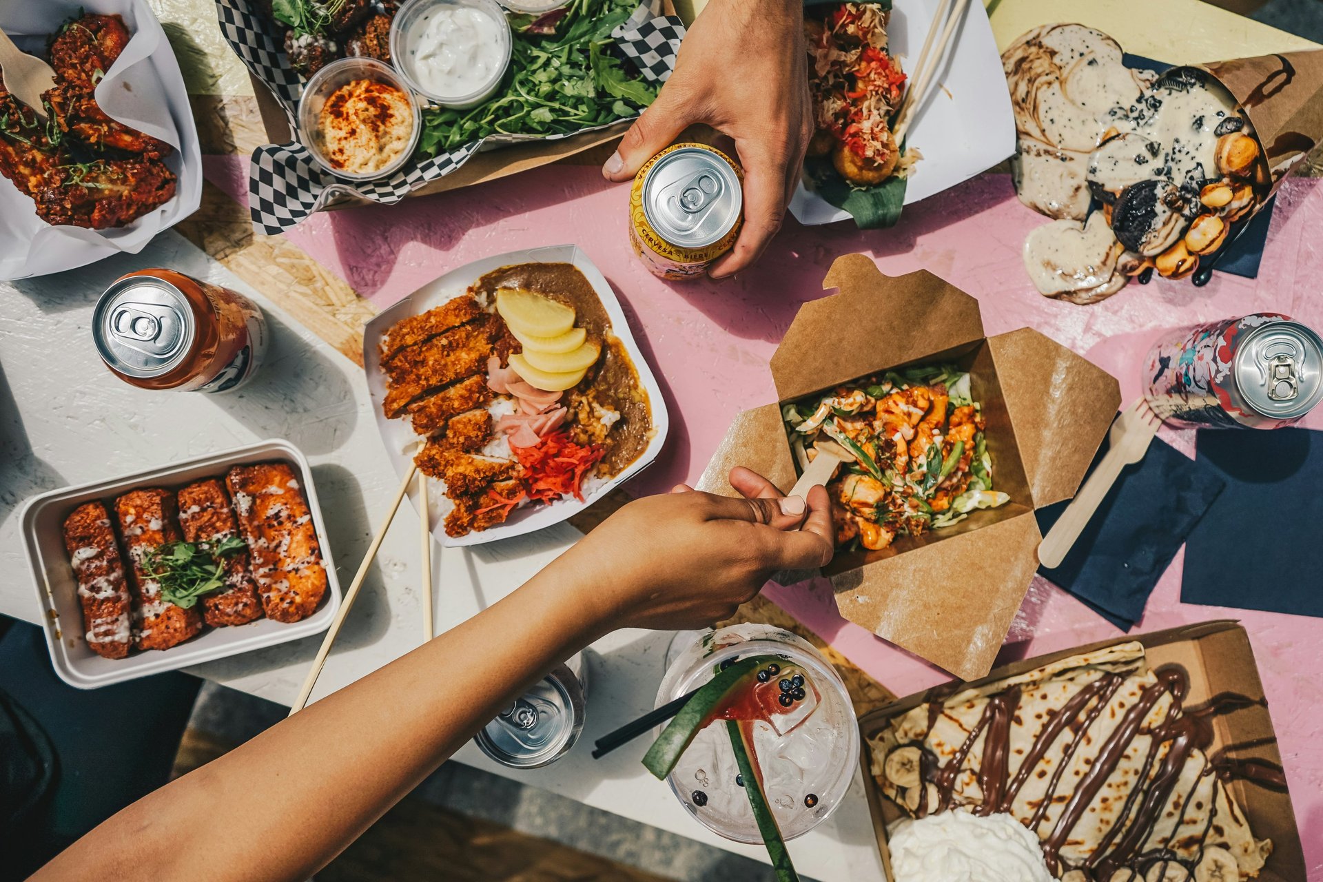
Project Summary: The DASH experience blends clarity, efficiency, and approachability. My focus was on crafting a seamless user journey through thoughtful navigation, minimal visual clutter, and confident calls-to-action. The result is a polished digital system that makes ordering food feel fast, effortless, and visually refined.
Design Concept: Intuitive Design Built on Trust and Clarity
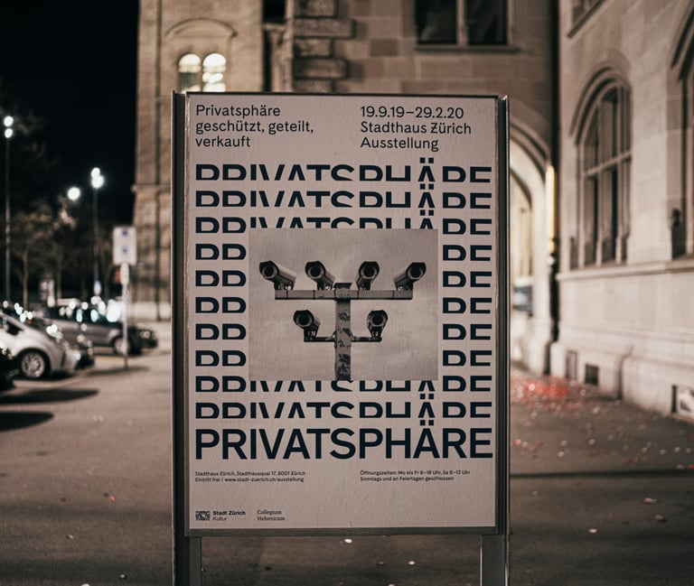
Other projects
Graphic Design / Motion Design
Graphic Design / Art Direction
